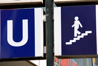
On March 3 I did a post on the interesting U-bahn signs that surround Munich. I was fascinated by their historical appeal. It was karin who provided all the insight I could have expected – stating that the current cool designs were done in the 70s, but were being phased out. I came across the first sign of modernization today (see picture), and I have to say that it’s a sad state of affairs. A three-year old could have designed this image, and it lacks all the sophisticated imagery that the current image has. Is there any way we can reverse the decision, with any hope of keeping the image of Munich as cool?
Saturday, April 3, 2010
Subscribe to:
Post Comments (Atom)


No comments:
Post a Comment